I’m studying Memo Kantun’s Ritual de los Bacabes as part of ongoing work to improve the writing generated by the #AncientMayaApp. This is the first in a series of posts about how the app’s approach to ancient Maya phonetic writing is evolving.
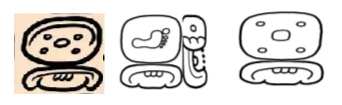
I started with a very simple word: “bina”, which appears several times in the text. The image compares three versions of the same word:
• Memo’s original writing
• the app’s older output
• the upcoming version
Previously, the app automatically constructed a three-syllable glyph block based on phonetic disharmony rules. That approach was rigid. Now, disharmony is under the user’s control. Also the new text editor allows any individual glyph in a block to be changed. This gives writers far more freedom to shape how a word actually looks on the page. This version of the app will be released in a week or two.
In Memo’s version of bina, the main glyph physically touches the bottom affix. The glyph block feels solid, as if one element is built directly on another. In the app’s version, there is a slight gap between these glyphs — they appear to float inside the block. Fixing this will take time, but it’s an important problem.
More broadly, Memo’s writing is simply more expressive and dynamic. The app currently uses glyph drawings from Alex Tokovinine’s Handbook, which is an extraordinary scholarly resource — but it represents a different visual feel. It may be useful to think of these sources as belonging to different “font families,” much as we do with Latin text today. Eventually, as the app’s writing tools mature, it will support several fonts giving users choice and control.
What do you think? Please comment!